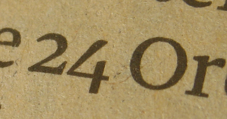
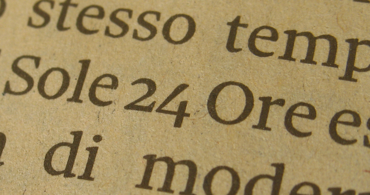
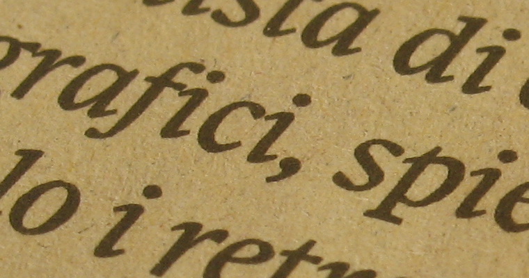
Some images of the new typeface designed for Il Sole 24 Ore, an important italian newspaper (the most important on economic subjects). The project was generated by a continous exchange between graphic designers (Attus, Cattaneo, Narracci — the art director –, Pitoni), my collaborators (Francesco Gioia, Igino Marini, Paolo Mazzetti, Riccardo Olocco, Michele Patanè) and me. This typeface was presented and used for the first time on december 4th 2010 (here it is a picture of the article — in italian — in which the new typeface was presented).
typefaces | license | research | profile | links | workshops
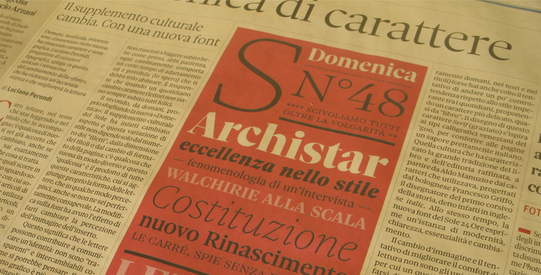
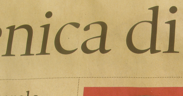
Cultural weekly supplement new design (November 5th).
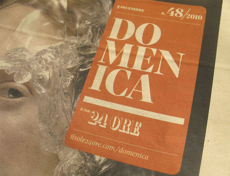
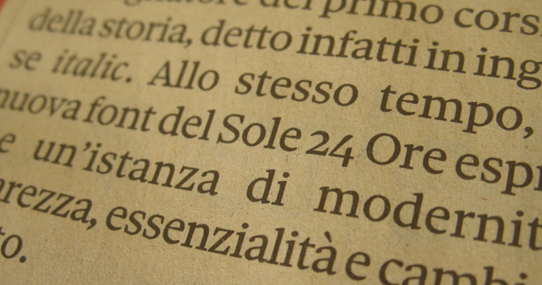
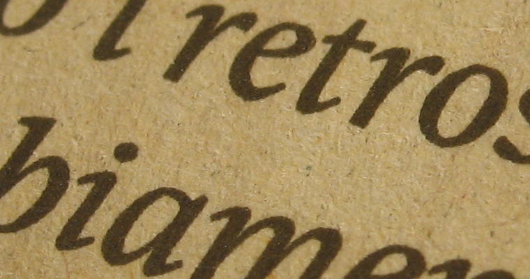
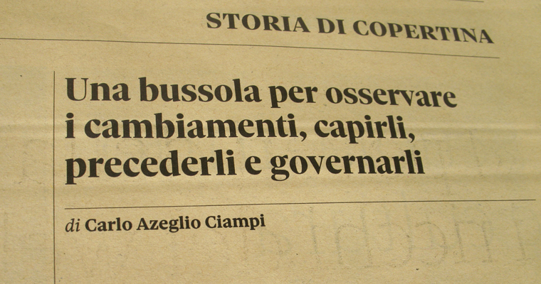
Presentation on the newspaper (November 4th).
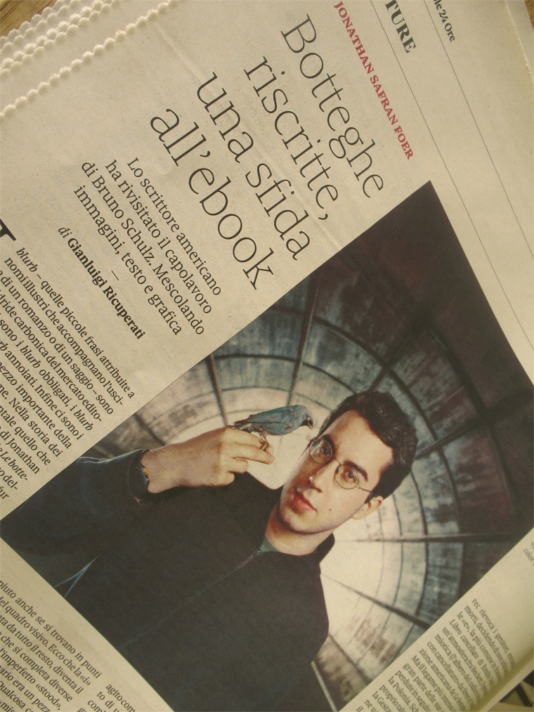
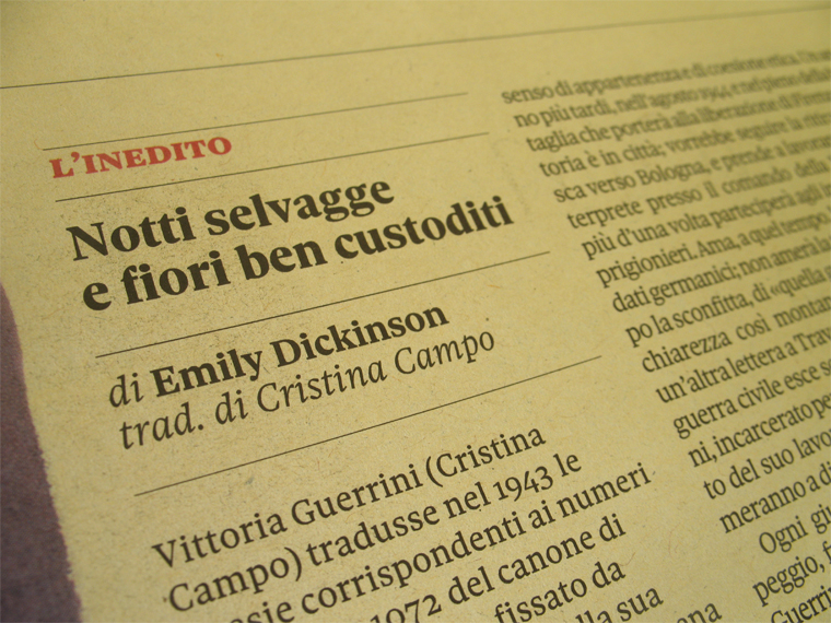
A page.
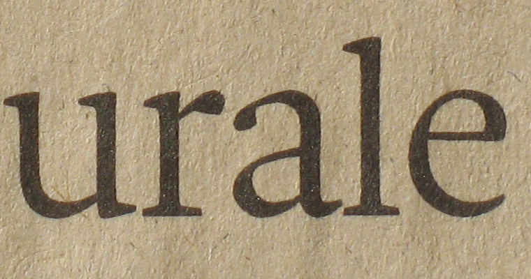
Text version.
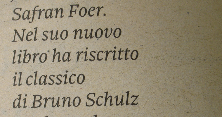
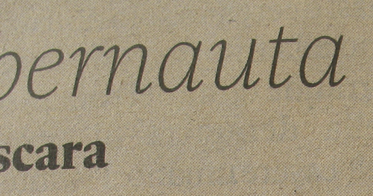
Italic Text.
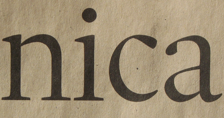
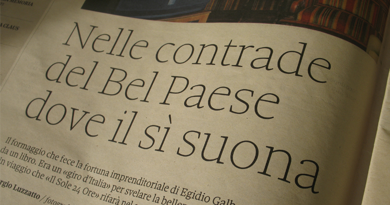
Display Roman.
Subhead.
Italic Subhead.
Text Roman, Italic & Bold + Subhead Black Roman & Smallcaps.
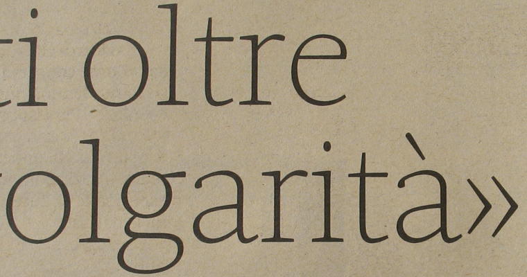
Hairline.
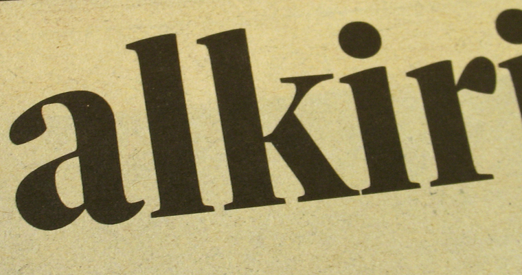
Black Display.
other typefaces:
Csuni, Carattere Senza Un Nome Importante/Typeface With No Important Name 2002-2003, included in ADI Design Index 2004!!
Sessantacinque, 2003- (work in progress)
DeA, for DeAgostini, 2003
Csuni1885, for Mattioli1885 (see also Experience1885), 2003
Mattioli1885*, for Mattioli1885 (see also Experience1885), 2003, included in ADI Design Index 2004!!
Zotico*, for Milano Film Festival & Zetalab, 2004
Ccunami*, Carattere Con Un Nome Ancora Meno Importante/Typeface With A Name Even Less Important, 2004 (work in progress)
Ninzioletto*, a stencil typeface designed for Venice sign system, commissioned by IUAV (www.iuav.it), 2004
Tecnotipo*, designed for Tecno by molotro + limbo, 2005
Soon on line Ccuncamism!!
The pdf of the forthcoming Dic Sans
> coming soon, new designs
> all the typefaces designed by Luciano Perondi until 23 01 2004
contacts:
Luciano Perondi
molotro@gmail.com
M ++39 388 1697785
P. IVA 02796210124